Coffee Table Book Tips
DESIGN YOUR OWN COFFEE TABLE BOOK WITH OUR EXPERT TIPS
A WhiteWall Coffee Table Book gives your photographs the space to tell a story. The fascination of holding your own motifs in your hands as a bound book is not only a visual experience but can also be experienced haptically thanks to the first-class workmanship and high-quality materials.
Today our Senior Art Director Fabian will show you how you can use the many options and design possibilities of WhiteWall to collect and present very special motifs in a high-quality Coffee Table Book.
1) Using the effect of size and white space

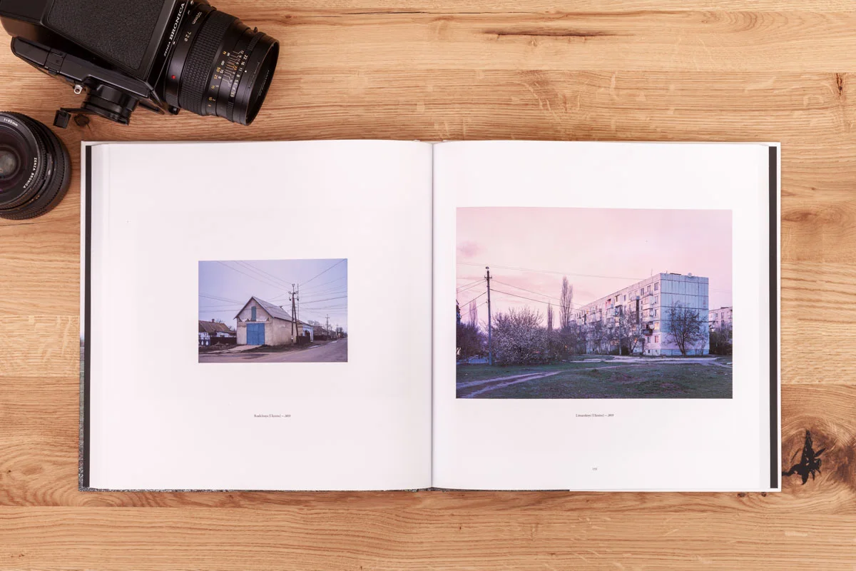
Image impact depends heavily on display size, and each photograph has different print size requirements. While subjects with emblematic, catchy shapes can be quickly captured at a small size, complex images with lots of detail require a larger display.
Another important design tool to influence the impact of a photograph is the white space around it. Plenty of white space calms the eye and thus the image effect. Large images with little or no white space, on the other hand, appear "noisier". They allow the viewer to become immersed in the subject more quickly and easily. In addition, it is possible to place images in the bleed beyond the edge of the page - the image is not closed off by a white space and is mentally extended beyond the page of the book.
In this example, the subject on the left shows a house whose shape is very emblematic, which allowed me to make the image smaller. It makes the layout more varied and exciting."
2) Telling stories through image sequences

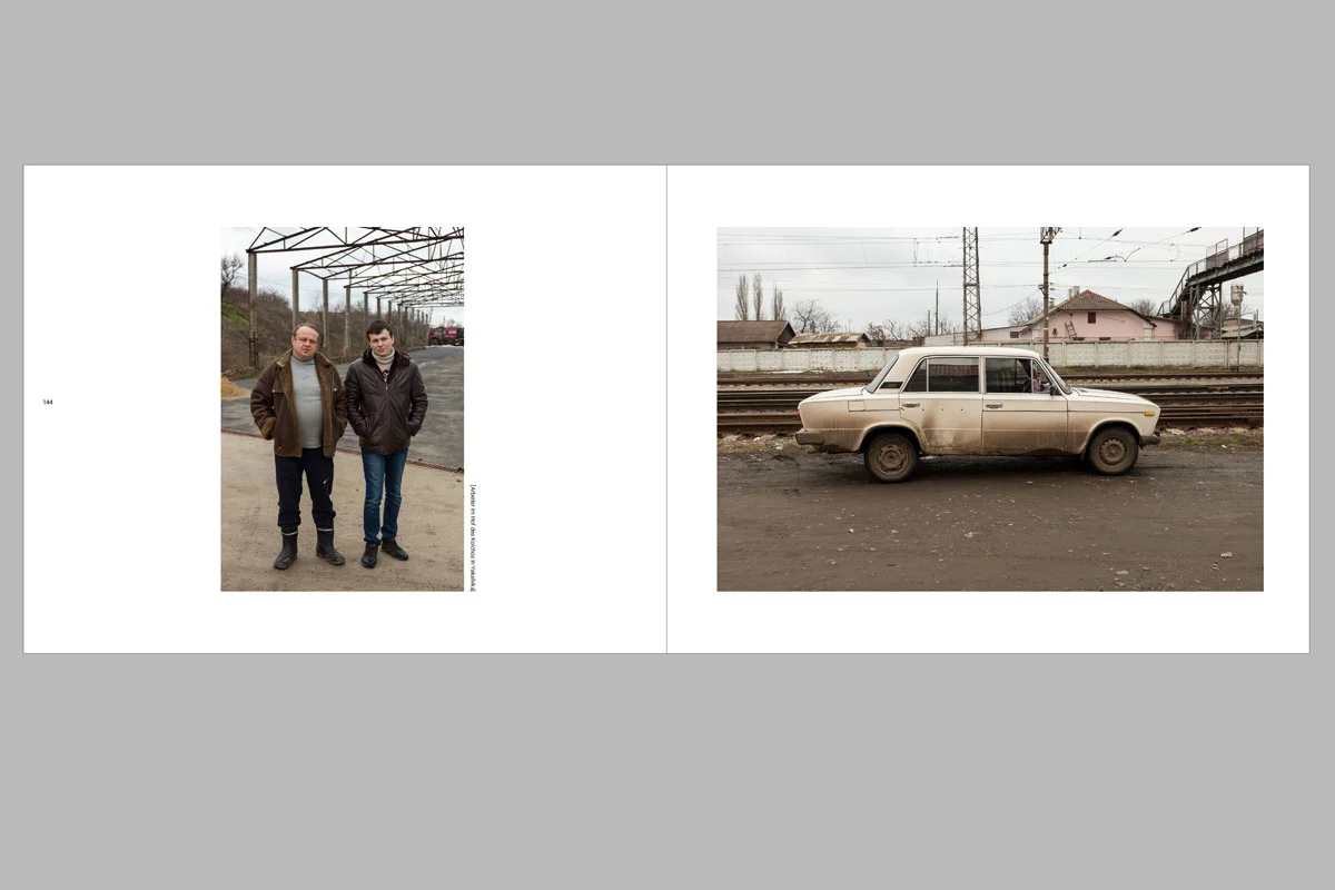
A page doesn't necessarily have to contain just one image. The illustrated book also offers the possibility of placing two or more images on a double page spread. This puts the pairs of images in relation to each other. Therefore, the motifs should always be chosen so that they either complement or contrast each other. In this example, the motifs were taken at the same location. By showing them in parallel, they come together to form a story: The car inevitably relates to the people depicted.
3) Designing with type

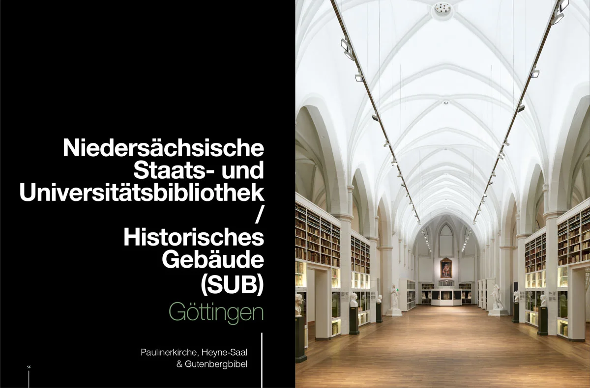
Typefaces or typography are commonplace to us. We encounter them in word processing, in e-mails, on posters, etc. However, the requirement for an illustrated book is different: the typeface must convey information and at the same time have a graphic statement. This is because the use of typography has a direct impact on the overall effect of the illustrated book. The choice of typeface is therefore very important - it should establish a connection to the content and aesthetics of the photographs shown. I recommend using a maximum of two different fonts - for the title and the body text. Here, for example, the typeface was used in different weights and an accent color. This creates a hierarchy that visually organizes the information.
4) The cover as a preview of the content

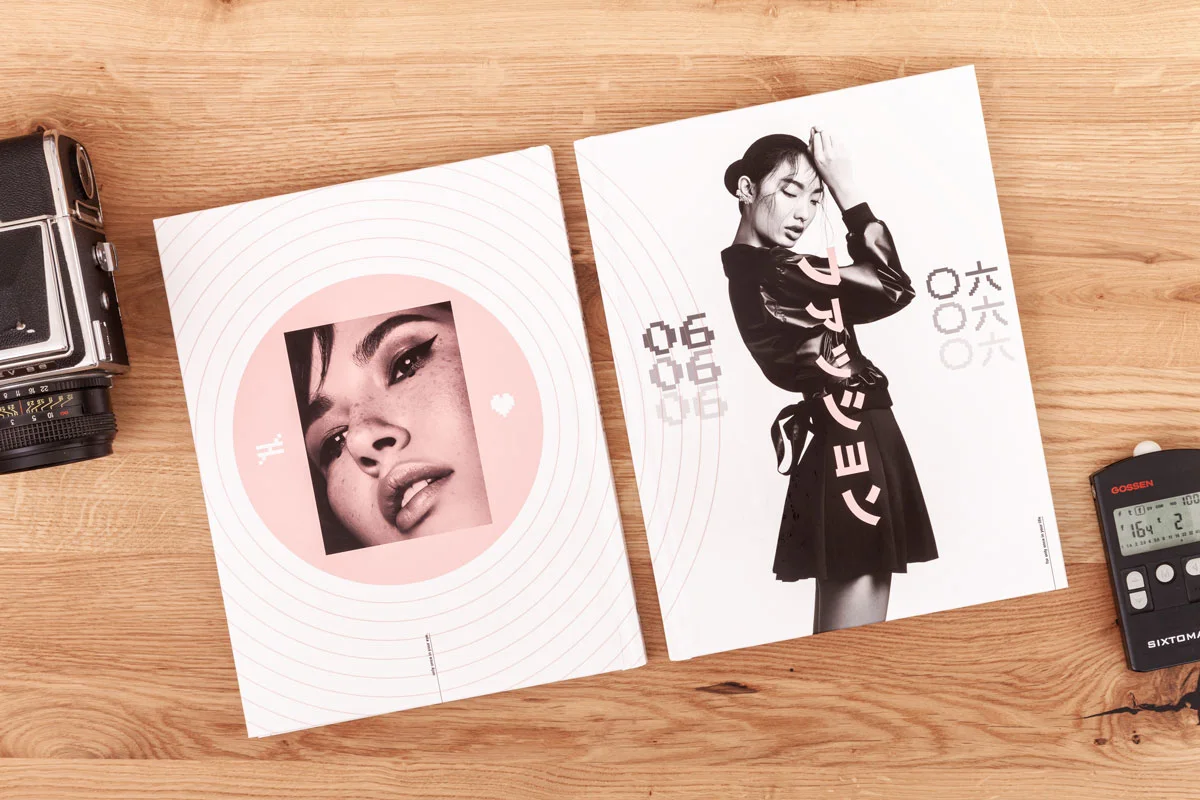
The cover is the face of the book and should make you curious about the content. Without giving too much away, of course. This is where the design principles come together and you can apply the tips mentioned above regarding image size, white space, and most importantly typography. The cover is representative of the entire content of the coffee table book. The design can be expressive, as in the example, or very restrained and calm - a purely typographic solution is also conceivable and can be implemented by WhiteWall.
First-class photo papers and binding solutions for your coffee table book
With six exquisite branded papers, the best qualities on the market are available to you for your coffee table book. To create a classic book cover, we use modern inkjet printing and elastic glue binding for high-quality inkjet papers. The innovative Fuji photo papers use a traditional photographic printing method. Here, a layflat binding reduces the fold to a minimum and is ideal for large-format photographs on double pages.

WhiteWall Coffee Table Book Sample Set
Get an overview of all the options available to you for your coffee table book – from different cover variants and endpapers to our inkjet and photo papers.
You will be refunded 100% of the purchase price for your samples (excl. shipping) in the form of a voucher. This will be sent to you in a separate email after the samples have been shipped and can be redeemed during your next order.
Hardcover glossy
Hardcover silk-matt
Hardcover with printed linen
Inkjet glossy - Fedrigoni Symbol Freelife Gloss (200 g/m²)
Inkjet silk-matt - Inapa Galaxi Art Samt (170 g/m²)
Inkjet high gloss - Fedrigoni Symbol Freelife Gloss (200 g/m² plus glossy finish)
Photo paper glossy - Fuji Crystal Archive Glossy (382 g/m²)
Photo paper silk-matt - Fuji Crystal Archive Lustre (368 g/m²)
Photo paper deep matt - Fuji Crystal Archive Velvet (370 g/m²)
White uncoated Fedrigoni paper (170 g/m²)
Black uncoated Fedrigoni paper (170 g/m²)


