Interview with Florian W. Mueller
Short profile
Florian W. Müller is a multi-award winning fine art and commercial photographer and creative director who lives in Cologne with his family and works worldwide. “I virtually always have a packed suitcase in the hallway.” In his images, he questions the status quo and searches for new perspectives. In an interview he reveals more about his work.
The interaction of motif and paper - experiences by Florian W. Müller
PROFESSIONAL TIPS FROM FLORIAN W. MÜLLER
Holding a successful motif in your hands as a print is an exciting step for every photographer, adding another dimension to the creative process of photography. Using the right paper plays an important role in this. To help you make the right choice, internationally renowned photographer Florian W. Müller today reveals his criteria for the perfect Fine Art paper based on three of his photo series. He has divided the Fine Art papers into three groups and selected the right paper for each motif.
Category 1: Papers with subtle structures
Category 2: Glossy papers with a strong, tactile texture
Category 3: Matt papers with clearly visible structures
WhiteWall expands its range with six Hahnemühle FineArt papers and has been awarded the Hahnemühle Certified Studio Platinum status – a prestigious seal of quality granted to only a select few partners of the world-renowned paper manufacturer.
Florian, how would you categorize Fine Art papers? What differences are important to you?
Roughly speaking: glossy, matte and textured. And there are differences and nuances for each point. And each motif can significantly enhance its own effect with an appropriately selected image.
WhiteWall sets new standards, especially when it comes to the selection of Fine Art papers. WhiteWall offers paper from Hahnemühle and Canson. These can be divided into the categories mentioned. This helps me to choose the right paper for motifs or series of motifs. We can illustrate this wonderfully with three series of my work.
Category 1: Papers with subtle structures
Lyonel 2000 series
Matt or glossy papers are particularly suitable for this series, without a strongly perceptible structure in the image. These papers are suitable for many types of motifs.
The following papers belong to this group:
Hahnemühle Photo Silk Baryta X
Hahnemühle Photo Rag
Hahnemühle Photo Rag Ultra Smooth
Hahnemühle Photo Rag Bright White
Canson Rag Photographique
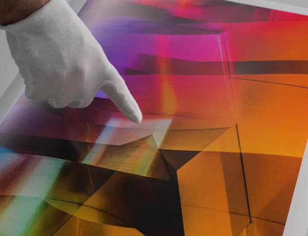
This series shows a great passion of mine: multiple exposures. These are architectural fragments that are abstracted by this technique, but whose geometric and almost tactile structure also gives them a figurative or multidimensional quality. Here, a clear structure of the paper could draw the viewer back too much to the two-dimensionality of the paper. Glossy or matt papers such as Hahnemühle Photo Silk Baryta X, Hahnemühle Photo Rag or Canson Rag Photographique without a strongly perceptible structure are particularly suitable for my “Lyonel 2000” series with its geometric and almost haptic structure.
Category 2: Glossy papers with a tactile texture
Ikarus series
Glossy/silk-gloss papers with a light to clearly visible structure are particularly suitable for these series.
The following papers belong to this group:
Hahnemühle FineArt Pearl
Hahnemühle FineArt Baryta
Hahnemühle Photo Rag Baryta
Hahnemühle Photo Rag Metallic
Canson Baryta Prestige II
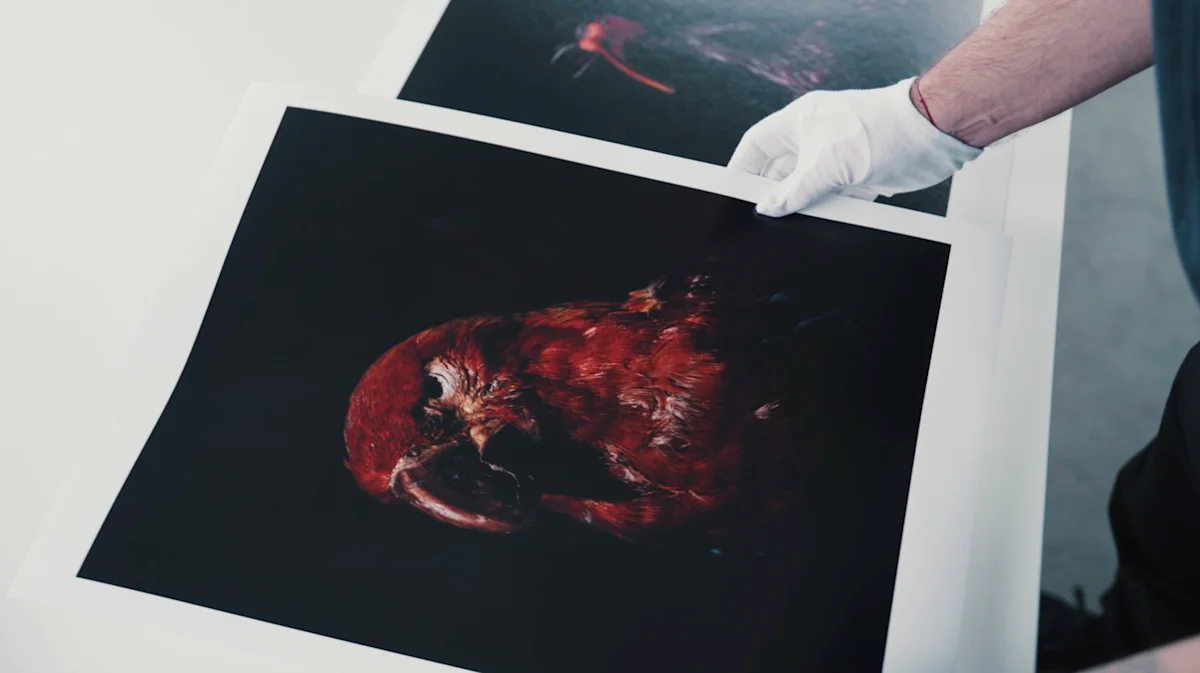
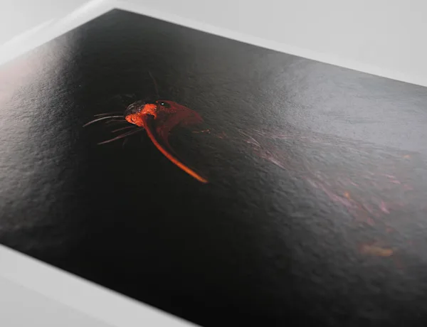
These pictures are part of a larger series - actually of several series - which are brought together in a group of works entitled “Equilibrium”. It is about endangered and extinct animal species, about an awareness of the - unfortunately often negative - interdependence between the environment and mankind. There are several series that I have realized with the wonderful support of the Senckenberg Institutes and Leica. Take the IKARUS series: birds, some of which have been extinct for over a hundred years, are raised photographically on a pedestal, almost in the style of old masters, with Rembrandt light. These motifs and this background call for a noble and brilliant presentation that immerses and captivates the viewer. A visible structure, as with Hahnemühle FineArt Baryta, Hahnemühle FineArt Pearl or Canson Baryta Prestige, also supports the feather structure of the pictures, which is also barely visible but present in the background of the pictures.
Category 3: Matte papers with a significant structure
Singularity series
Very matt surfaces with a clearly visible structure are suitable for this series.
The following papers belong to this group:
Hahnemühle William Turner
Hahnemühle Torchon
Hahnemühle Bamboo
Hahnemühle German Etching
Canson Aquarelle Rag
The Singularity series is all about architecture. The theme is reduction to the maximum, the building itself. There must be no distraction through excessive gloss. The mixture of large buildings and visual minimalism is enhanced by a matt surface; you can concentrate on details without losing sight of the big picture. I have also given the sky in the pictures a light grain, which also works wonderfully with a matt, almost rough texture such as Hahnemühle Torchon, Hahnemühle William Turner or Canson Aquarelle Rag.
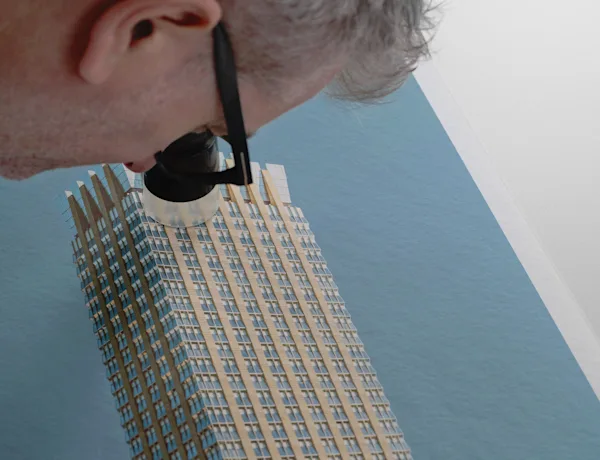
Finest Texture and Optics: The New Hahnemühle Papers

Discover our new Hahnemühle Papers
Category 1: Papers with subtle structures
Photo Rag Ultra Smooth: Exceptionally smooth, velvety surface with a subtle texture for detailed and soft image reproduction.
Photo Rag Bright White: Bright white cotton paper with a lightly pronounced felt texture and a matte premium inkjet coating for deep blacks and exceptional detail reproduction.

Category 2: Glossy papers with a tactile texture
Photo Rag Baryta: A barium-coated, warm-toned cotton paper delivering brilliant colors and high contrast with a subtly textured surface.
Photo Rag Metallic: A high-gloss cotton paper with a shimmering finish for striking silver-metallic effects.

Category 3: Matte papers with a significant structure
German Etching: A traditional mould-made copperplate printing paper crafted from 100% alpha cellulose, featuring a pronounced felt texture and a velvety feel.
Bamboo: The world’s first FineArt inkjet paper made from 90% sustainable bamboo fibers, offering a soft, lightly textured felt surface.

As part of the renowned Hahnemühle Excellence Program, WhiteWall is one of the few photo labs worldwide to have been awarded the prestigious Hahnemühle Certified Studio Platinum status.
This certification underlines our outstanding quality, reliability and exceptional service.

QUESTIONS TO FLORIAN W. MÜLLER
Can you tell us how you got into photography? And tell us something about your work.
I'm a self-taught photographer. But I've been taking photos all my life. Ever since my father showed me the magic of developing an image in his darkroom. I will always be grateful to him for that. He gave me my first camera when I was 6, an Agfa Rapid with the modest settings ‘sun’, ‘clouds’ and ‘flash’. I still have that camera. Soon afterwards, he showed me the interplay of shutter speed and aperture and so on on an old Voigtländer. Although I had earned my living in radio and television, the first assignments from clients and agencies came while I was still studying. I also worked as a still and set photographer for film and television productions on the side.
After I organised my first exhibitions with two photographer friends and they were well received, I decided to make photography the focus of my career. Relatively quickly, I also started to get commissioned work, where I am very lucky that clients often orientate themselves towards free and more artistic work. That's great, of course. Today I work and publish internationally, my work is exhibited and honoured worldwide. I am a professional in the BFF, a member of the DGPh and the English AOP (Association of Photographers).
Please share something about your images. What is your special interest? How do you choose the colors, composition, themes etc.?
My free series are often about abstract representations with the help of multiple exposures, different layers or abstraction through reduction or concentration. For example, architectural fragments that are detached from their spatial context or are given a graphic level through several layers of photography. Or it is about protecting species or highlighting the interdependencies in our environment, in which humans intervene sensitively and upset the balance in nature. For example, in the series ‘Anima’, ‘Ikarus’, ‘Samsa’ and ‘Basilisk’, which come together in the ‘Equilibrium’ group of works and were created with the grateful support of the Senckenberg Institute.
I'm inspired by all sorts of things, art is an important factor, I've been a big fan of the expressionists for a very long time, especially Lyonel Feininger and the abstract expressionist Jackson Pollock. Music plays a role, just like films. But also the everyday. There is this principle called serendipity, which is also a term more commonly used in English-speaking countries. Put simply, it's about finding something you weren't looking for. This means that if you walk around with your antennas open, you will always discover something new and exciting, even if you have walked past it a thousand times. I call it the ‘fluff sieve of perception’. It's worth looking in there more often!
I have a lot of drawers in my subject cupboard, from macro photography and still lifes to abstract photography, landscapes and architecture. In terms of advertising, I often have cars in front of my lens and, as I said, I'm lucky that the creative idea often takes centre stage here too. I'm always happy when a client doesn't want the status quo but wants to break new ground.
I also have a rather subconscious connection to colours. I have synaesthesia, which means - to put it simply - that I associate colours with certain sounds and vice versa. Sensory impressions are therefore not only limited to their respective ‘channel’ (hearing, seeing, tasting), but sometimes communicate in a wild mix. The colourful and abstract pictures of ‘Lyonel 2000’ (my little homage to Lyonel Feininger) therefore also have a musical level for me. But here, too, little happens according to a specific plan, it's very much about trying things out, ‘feeling my way in’.
How has your artistic style developed over the years and what influences have shaped your work?
I don't know if and in what direction my work has changed. In retrospect, there are certainly pictures that I would do differently today, but that's often down to the editing. It's always worth taking a look from a distance to see whether the design might only have a short half-life. Technical progress has certainly changed things. New and creative ways of presenting my work at WhiteWall can also be a booster for new projects. Since I've been shooting with Leica, photography itself has also reached a new level and I often try to push the camera to its limits. The fact that I travel the world a lot for work has certainly broadened my horizons and therefore also the influences that are reflected in my work. However, the conversations with colleagues have certainly helped me a lot. It's no exaggeration to say that my photographic learning curve has gone steeply upwards since I joined the BFF and the English AOP. Encounters, exhibitions and discussions are a great motivator for me.
Do you have favourite formats or techniques that you prefer and why?
As far as formats are concerned, I'm not fixed. There was a time when I organised my first exhibitions, when I almost only showed square pictures. Today I ask myself what was wrong with me then. ‘Form follows function’ also applies to me in photography. But in artistic photography, the term ‘function’ often has a different meaning than in advertising or design. This function is the often abstract connection between the viewer and the image. Subjective and usually subconscious. I like to try things out. Breaking supposed rules is part of it: Landscapes don't have to be in landscape format, round pictures: Why not! A short anecdote: I once took part in a group exhibition in a gallery in Nottingham, England. I was invited to contribute my work on the subject of ‘Contemporary Photography’. I think WhiteWall had a fairly new programme of round pictures. I was working on a series with double exposures of landscape motifs and concrete surfaces and thought ‘Round? Great!’ There were a few of these pictures hanging in the gallery and I often stood next to visitors for whom this was very new and unusual. I often heard ‘It's beautiful. But... it's round!’The result was a dialogue between the viewer and my work. The format was just the hook. The response was (almost) only positive, the pictures have remained in my memory.
To what extent are personal experiences or emotions reflected in your art, and how do they influence your creative decisions?
Everything we experience, what moves us, what frightens us or gives us pleasure, whether consciously or unconsciously, influences our thoughts, feelings and actions. This also applies to art. Perhaps even more so here, because we (supposedly) act more freely and personally. I wouldn't go so far as to attribute certain series or pictures to a specific emotional phase of my life. But there are definitely tendencies. I've been called the ‘dark painter’ here and there because my pictures are often rather dark. More minor than major, so to speak. I'm not (so often) melancholic or gloomy, which you might (superficially) associate with this style. I see in it more possibilities for pausing, for calm, for contemplation. If not everything is immediately recognisable, if connections with a picture can only arise because you are looking for clues, points of reference, you have the opportunity to approach a picture differently. But that's just my theory, there's no plan behind it, it happens unintentionally. Another example of (my) emotional level of a picture or a series: I really like New York, even though this city, especially Manhattan, is terribly loud, everything is hectic, the people are often gruff (but cordial). Nevertheless, paradoxically, I can feel very comfortable in this chaos, almost relaxed. I wanted to capture this experience in a picture. The result is the ‘Multivision’ series. Chaotic multiple exposures that show exactly that: they are mixed up, chaotic and yet they radiate a strange calm. This was followed by Hong Kong and Istanbul, among others, as motifs - it's the same principle.
What makes fine art prints special for you? Why did you choose WhiteWall?
Firstly, I like working with professionals. Secondly, the exchange is great, I certainly don't know all the ways to present a picture, with WhiteWall I have so many options, of which I may not even know the right one. This is where the exchange comes into play, the counselling. It's also uncomplicated. When I'm planning an exhibition, I can be sure that I have a partner at my side who will support me and listen to my questions and perhaps come up with an idea that I hadn't thought of. What is also important to me is that the pictures are produced here, on site. From the frame moulding to the fine art print (or the exposure) or the lamination. Everything is produced here near Cologne.
WhiteWall Product Recommendations
You might also like these articles:
Submitted by WhiteWall Team
4 steps to large-format lamination with Jan-Ole Schmidt
Our colleague Jan-Ole Schmidt explains in a detailed example how you can check your motif in advance with test prints before placing a large order.
Submitted by WhiteWall expert Katharina Wergen
Various print media and formats
In the previous chapter, we have already explained what you should pay attention to when preparing for printing. This article from WhiteWall should now help you to get an overview of the various file formats and export options. And to understand when you should use which format - and why others are rather unsuitable for printing.
Submitted by WhiteWall Team
Fascinating perspectives of nature by Florian W. Müller
In an interview on the occasion of his exhibition “Equilibrium” in Wetzlar, Florian W. Müller reveals more about his love for nature and nature photography, his working methods and which creature will be the star of his next project.


